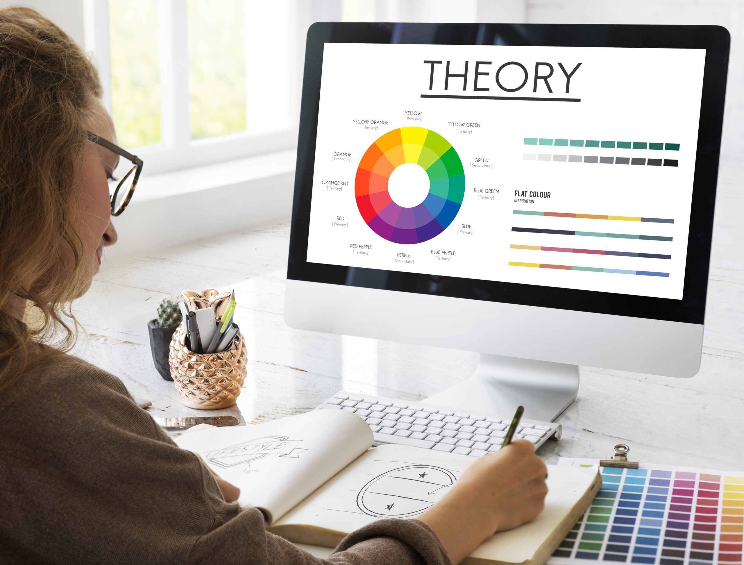
Colour is an important aspect of marketing, particularly when establishing your company’s identity and logo. According to the Exciting Red and Competent Blue research, colour psychology in branding has a major impact on purchase intent because of the influence it has on a brand’s impression. since a result, it’s critical to select the proper branding colours that reflect your personality and behaviours, since this will have a significant influence on your small business.
Each colour reflects a particular personality element of the company, therefore choosing the proper branding colours that match your business type is crucial. The colour of your brand tells volumes about your marketing branding strategy, and it’s the first thing people see before they see your logo design or brand name. As a result, choosing the proper colours is vital to your success.
Colours are an important aspect of many of the world’s most well-known businesses’ visual identities and brand identification, including Cadbury, Virgin, and Starbucks. Specific colours spring to mind when you think of these companies. For example, it’s difficult to imagine Coca-Cola without thinking the swirling red logo, or McDonald’s without picturing the iconic yellow arches. This is why branding colour choices are important and have an impact on businesses.
Colours are a wonderful way to identify a brand and should be addressed early in the creative process. Bright colour combinations are regularly employed by brands to energise their target audience. Colours express emotions, sensations, and experiences, making them more than just a decorative element. Colours have connotations, and companies should be aware of this since picking a colour scheme may make or break them.
Why is Colour Psychology Important in Branding?
Color psychology is a field of psychology that explores the impact of colors on human behavior. It dates back to ancient times when Egyptians studied the effects of colors on mood and utilized them for holistic development. They associated red with increased circulation, yellow with body purification, blue with pain relief, purple with skin problems, orange with increased energy, and black with life and rebirth.
Swiss psychiatrist Carl Jung also believed in the special connection between colors and humans. He stated that “humans have a universal bodily response to color stimulus,” and added that “colors are the mother tongue of the subconscious.” This highlights the significant influence of colors on our psychological and emotional responses.
- Colour Contrast Can Help With Recall
Entrepreneur explains that the Isolation Effect suggests that a product which is noticeably distinct is more likely to be memorable. This is the reason why brands use contrasting colors to their advantage. The Facebook logo, with its white and blue colors, and the purple and orange of FedEx are both examples of bold, contrasting colors that are immediately identifiable and easy to remember. It is important to ensure that your brand colors stand out and contrast against the background to help your advertisements stick in the minds of consumers long after they have moved on. - Colour may help you reach out to specific demographics
According to Entrepreneur, studies have shown that color perception and preferences vary by gender. Men tend to favor strong, opaque, and solid colors, while women often prefer lighter shades that are less opaque and mixed with white. For example, if you are advertising a new coffee drink in a coffee shop, using bold colors in your marketing materials may appeal more to men and convey excitement about the beverage. Conversely, using softer hues that evoke a gentle morning wakefulness could be more effective when advertising the coffee shop’s latest breakfast sandwiches to women.
While many factors contribute to the effectiveness of an advertisement, color cannot be overlooked. Selecting the right hues for your ads can impact first impressions, recall, and even the demographics your ads reach. - Influence on conversions
Research has established a correlation between colors and conversion rates. In a conversion page study, two colors, green and red, were used to examine their impact on the outcome. Results showed that changing the button color to red led to a 21% increase in conversions, indicating that more people clicked on the red button than the green button. Since everything else on the pages was identical, the only difference was the color.
This highlights the significant influence of color on conversions. Specific colors may encourage action, so it is crucial to conduct various A/B tests before deciding on a particular color to represent your brand.
Branding is the art of effectively communicating the essence of your company, its products, and services to your employees and the world at large. It involves informing your current and potential customers, as well as your employees, about the nature of your business and what it stands for. This intricate process combines visual communication with behavior to create a public image that accurately represents who you are.